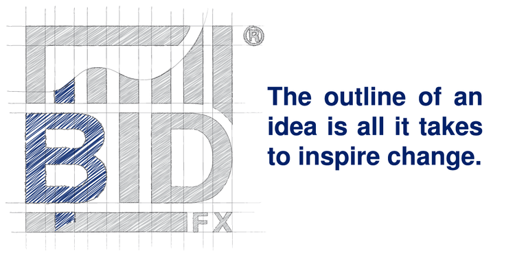
When we designed the original BidFX®logo, we started with the company name – in a bold sans-serif font – enclosed in a clean square border. To represent the growth potential of FX trading, we incorporated an upward trending price chart with an exponential flourish. The result, when finished in Royal Blue, is a strong corporate mark that is ideal for print media and merchandising. Unfortunately, in hindsight, the trademark has proved to be less well suited to digital use. It is too detailed to be rendered clearly at smaller dimensions. Shrink it down to a browser favicon, and you get a garbled blob. As our products are served digitally, it was time to embrace change and redesign for digital communication.
Our need was for an uncomplicated logo to supplement the original, one that would rasterise well at the small sizes needed for responsive iconography. I wanted the supplementary mark to maintain and enforce the critical elements of the existing BidFX brand, including its colour and the metaphor of trading FX. The digital icon should provide a subconscious link to the corporate logo. I took inspiration by sketching an outline of the existing BidFX logo. To emphasise the FX connection, I considered currency symbols. By shading in the letter “B” and the first bar of the trend chart, I cut a shape suggestive a currency character. The resemblance is further enforced by replicating the bar, rotating it, and placing it below to complete the strike-through of the letter “B” – making it comparable to a Thai Baht sign. The resulting mark not only invokes a visual association to the original logo, it’s an exact geometrical subset of it.
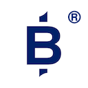
Look out for our latest registered trademark in upcoming digital products from BidFX.
Have a Question?
If you have any questions about what we offer or to make an enquiry, get in touch with us today.